
| 일 | 월 | 화 | 수 | 목 | 금 | 토 |
|---|---|---|---|---|---|---|
| 1 | 2 | 3 | ||||
| 4 | 5 | 6 | 7 | 8 | 9 | 10 |
| 11 | 12 | 13 | 14 | 15 | 16 | 17 |
| 18 | 19 | 20 | 21 | 22 | 23 | 24 |
| 25 | 26 | 27 | 28 | 29 | 30 | 31 |
- matplotlib
- 프로그래머스
- 빅분기
- Oracel
- level 2
- 실기
- 카카오
- 코딩테스트
- 파이썬
- Python
- oracle
- 알고리즘
- 실습
- SQL
- 머신러닝
- level 1
- sklearn
- pandas
- Kaggle
- python3
- R
- Numpy
- seaborn
- 튜닝
- 오라클
- 데이터 분석
- 빅데이터 분석 기사
- Today
- Total
라일락 꽃이 피는 날
[Seaborn] matplotlib 그래프를 seaborn으로 그리기 본문
seaborn
matplotlib을 기반으로 다양한 색상과 차트를 지원하는 라이브러리
컬러 팔레트를 이용한 아름다운 디자인과 쉬운 사용성 보유
seaborn에서만 제공되는 통계 기능 기반의 plot
pandas, matplotlib와 호환 가능
seaborn: statistical data visualization — seaborn 0.11.1 documentation
Seaborn is a Python data visualization library based on matplotlib. It provides a high-level interface for drawing attractive and informative statistical graphics. For a brief introduction to the ideas behind the library, you can read the introductory note
seaborn.pydata.org
import seaborn as sns
1. Scatterplot
sizes 옵션에서는 사이즈의 min, max를 명시
hue 옵션에 비교할 그룹 명시
palette 옵션을 통해 seaborn이 제공하는 아름다운 palette를 이용
x = np.random.rand(50)
y = np.random.rand(50)

colors = np.arange(50)
area = x * y * 1000

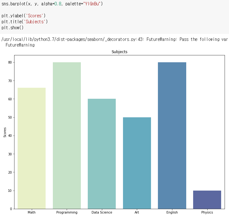
2. Barplot, Barhplot
그래프를 임의로 그려야 하는 경우 → matplotlib
DataFrame을 가지고 그리는 경우 → seaborn
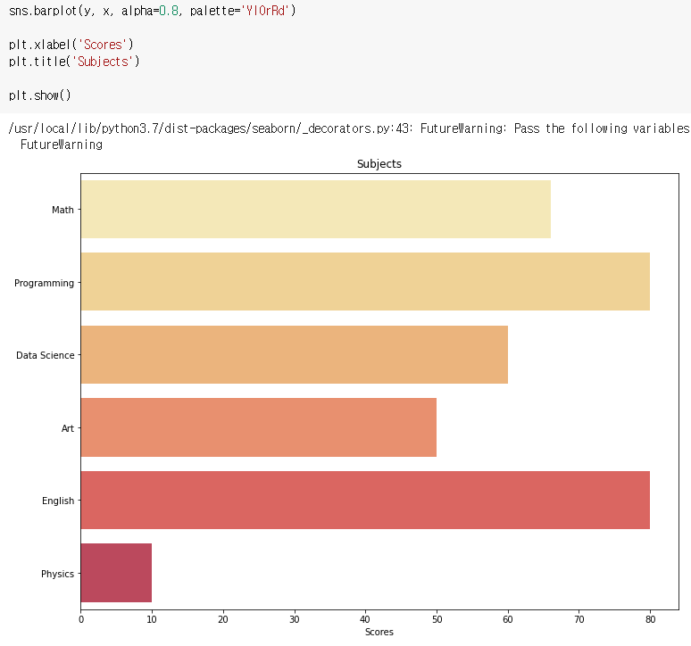
x = ['Math', 'Programming', 'Data Science', 'Art', 'English', 'Physics']
y = [66, 80, 60, 50, 80, 10]
기본 Barhplot 그리기
x와 y를 바꾸면 barhplot이 그려진다.
비교 그래프 그리기
hue 옵션으로 매우 쉽게 비교 barplot을 그릴 수 있다.

3. Line Plot
x = np.arange(0, 10, 0.1)
y = 1 + np.sin(x)

4. Histogram
N = 100000
bins = 30
x = np.random.randn(N)

kde = True 로 설정하면 Density가 Y축에 표기 된다.
vertical = True 로 설정하면 가로 그래프가 된다.

5. Box Plot
그래프를 임의로 그려야 하는 경우 → matplotlib
DataFrame을 가지고 그리는 경우 → seaborn
spread = np.random.rand(50) * 100
center = np.ones(25) * 50
flier_high = np.random.rand(10) * 100 + 100
flier_low = np.random.rand(10) * -100
data = np.concatenate((spread, center, flier_high, flier_low))

다중 박스플롯 생성
hue 옵션으로 매우 쉽게 비교 boxplot을 그릴 수 있다.

'데이터 분석 > Python' 카테고리의 다른 글
| [Seaborn] 그래프 그리기 2 (0) | 2021.05.11 |
|---|---|
| [Seaborn] 그래프 그리기 1 (0) | 2021.05.11 |
| [Matplotlib] 다양한 그래프 그리기 2 (0) | 2021.05.11 |
| [Matplotlib] 다양한 그래프 그리기 1 (0) | 2021.05.11 |
| [Matplotlib] 스타일 설정 (0) | 2021.05.08 |