
Notice
Recent Posts
Recent Comments
Link
| 일 | 월 | 화 | 수 | 목 | 금 | 토 |
|---|---|---|---|---|---|---|
| 1 | 2 | 3 | ||||
| 4 | 5 | 6 | 7 | 8 | 9 | 10 |
| 11 | 12 | 13 | 14 | 15 | 16 | 17 |
| 18 | 19 | 20 | 21 | 22 | 23 | 24 |
| 25 | 26 | 27 | 28 | 29 | 30 | 31 |
Tags
- matplotlib
- sklearn
- level 2
- 알고리즘
- 실기
- 빅분기
- 오라클
- 빅데이터 분석 기사
- SQL
- 코딩테스트
- 튜닝
- 데이터 분석
- seaborn
- Numpy
- 프로그래머스
- 카카오
- pandas
- Python
- python3
- oracle
- level 1
- 파이썬
- 머신러닝
- 실습
- R
- Kaggle
- Oracel
Archives
- Today
- Total
라일락 꽃이 피는 날
The Iris Dataset (1) - K-Means 본문
728x90
데이터 정보
- sepal length (cm): 꽃받침 길이
- sepal width (cm): 꽃받침 폭
- petal length (cm): 꽃잎 길이
- petal width (cm): 꽃잎 폭
- target: 꽃 종류 (0: Setosa, 1: Versicolor, 2: Virginica)
데이터셋 준비
import numpy as np
import pandas as pd
from sklearn.datasets import load_iris
from sklearn.model_selection import train_test_split
# iris 데이터셋 불러오기
iris = load_iris()
# array 형태의 데이터를 Dataframe으로 변환
iris_df = pd.DataFrame(data=iris.data, columns=iris.feature_names)
iris_df.head()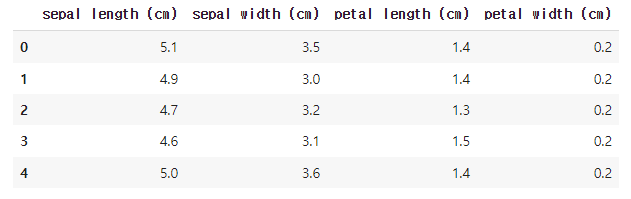
데이터 전처리
# 컬럼명을 사용하기 편하게 재할당
column_name_lst = ["sepal_length", "sepal_width", "petal_length", "petal_width"]

# 방법1: 순서대로 입력
iris_df.columns = column_name_lst

# 방법2: dictionary를 사용하여 변경
columns_replace_dict = {k:v for k, v in zip(iris.feature_names, column_name_lst)}
iris_df.rename(columns_replace_dict, axis='columns', inplace=True)
iris_df.head()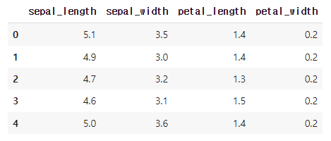
# target 컬럼 추가
iris_df['target'] = iris.target

# target 종류 확인
iris_df.target.unique()  # array([0, 1, 2])
# 컬럼별 결측값 유무 확인
iris_df.isnull().sum()
sepal_length 0
sepal_width 0
petal_length 0
petal_width 0
target 0
dtype: int64null 데이터 없음
# 컬럼별 데이터 type 확인
iris_df.dtypes
sepal_length float64
sepal_width float64
petal_length float64
petal_width float64
target int64
dtype: object수치형 데이터: sepal_length, sepal_width, petal_length, petal_width
타겟 데이터: target
# 컬럼별 분포 특징 확인
iris_df.describe()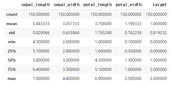
import plotly.express as px# plotly를 사용하여 scatter plot 시각화
# color 옵션으로 색 표현
fig = px.scatter(iris_df, x='sepal_length', y='sepal_width', color='target')
# 그래프 사이즈 조절
fig.update_layout(width=600, height=500)
# 그래프 확인
fig.show()
대체적으로 꽃받침의 길이와 폭은 비례한다.
타겟이 0인 꽃받침의 폭이 넓고, 2인 꽃받침의 길이가 길다.
fig = px.scatter(iris_df, x='petal_length', y='petal_width', color='target')
fig.update_layout(width=600, height=500)
fig.show()
대체적으로 꽃잎의 길이와 폭은 비례한다.
꽃잎의 길이와 폭에 따라 타겟이 나뉘어진다.
Clustering : K-Means 알고리즘
[k-means 최적의 환경]
- 원형 혹은 구(spherical) 형태의 분포
- 동일한 데이터 분포 (size of cluster)
- 동일한 밀집도 (dense of cluster)
- 군집의 센터에 주로 밀집된 분포
- Noise와 outlier가 적은 분포
[k-means의 민감성]
- Noise와 outlier에 민감함.
- 처음 시작하는 점에 따라 결과에 영향을 줌.
- k값을 직접 설정해야하는 어려움이 있음.
1. 학습 데이터와 테스트 데이터 분리
X = iris_df.iloc[:, :-1]
Y = iris_df.iloc[:, -1]

# train_test_split를 사용하여 iris 데이터를 8:2의 비율로 분리
train_x, test_x, train_y, test_y = train_test_split(X, Y, test_size=0.2, random_state=1)
print(len(train_x), len(test_x))  # 120 30
2. K-Means 모듈 훈련
from sklearn.cluster import KMeanskm = KMeans(n_clusters=5)
km.fit(train_x)
# Sum of squared distances of samples to their closest cluster center
km.inertia_ # 35.699845
clusters_array = km.labels_
clusters_arrayarray([4, 3, 2, 0, 0, 1, 2, 1, 4, 0, 0, 1, 4, 0, 4, 3, 1, 1, 1, 2, 1, 1,
3, 0, 3, 0, 4, 4, 3, 2, 1, 4, 4, 1, 1, 0, 1, 4, 0, 4, 4, 0, 4, 1,
2, 4, 0, 2, 0, 2, 1, 1, 1, 0, 1, 4, 0, 4, 1, 1, 2, 1, 3, 4, 3, 0,
4, 0, 3, 2, 1, 2, 1, 2, 4, 1, 4, 1, 1, 0, 4, 0, 1, 1, 4, 1, 4, 1,
0, 2, 1, 0, 1, 2, 1, 2, 2, 1, 1, 2, 1, 4, 4, 1, 4, 2, 4, 4, 4, 1,
1, 4, 2, 3, 2, 4, 0, 4, 0, 1], dtype=int32)
# 실제 iris 데이터 그룹과 훈련된 cluster의 결과를 비교
compare_clusters = dict(zip(clusters_array, train_y))
compare_clusters  # {0: 2, 1: 0, 2: 1, 3: 2, 4: 1}
# 훈련된 label을 기준으로 scatter plot 시각화
fig = px.scatter(x=train_x['sepal_width'], y=train_x['sepal_length'], color=clusters_array)
fig.update_layout(width=600, height=500)
fig.show()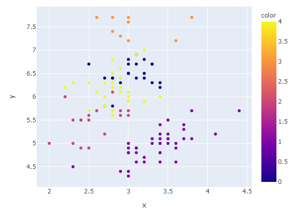
꽃받침의 폭이 좁고 길이가 긴 그룹이 더 세분화되어 나뉘어졌다.
fig = px.scatter(x=train_x['petal_width'], y=train_x['petal_length'], color=clusters_array)
fig.update_layout(width=600, height=500)
fig.show()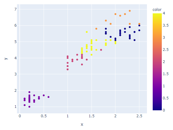
꽃잎의 폭이 넓고 길이가 긴 그룹이 더 세분화되어 나뉘어졌다.
3. 최적의 k 찾기 (Elbow method)
Total intra-cluster variation (or total within-cluster sum of square (WSS))가 최소가 되는 k를 찾는 방법
# elbow method를 사용하여 최적의 k 찾기
distortions = []
k_range = range(1, 11)

distortions = []
k_range = range(1, 11)
for i in k_range:
    km = KMeans(n_clusters=i)
    km.fit(train_x)
    distortions.append(km.inertia_)

print(distortions)
# [549.0235000000001, 123.1564001234949, 63.861880396389324, 45.493943093943095,
# 35.699845463911686, 30.71748514002504, 26.5000080593641, 23.756977548595195,
# 22.359555555555552, 20.983627638665688]
# x축이 k의 수, y축이 distortions인 line plot 그리기
fig = px.line(x=k_range, y=distortions, labels={'x':'k', 'y':'distortions'})
fig.update_layout(width=800, height=500)
fig.show()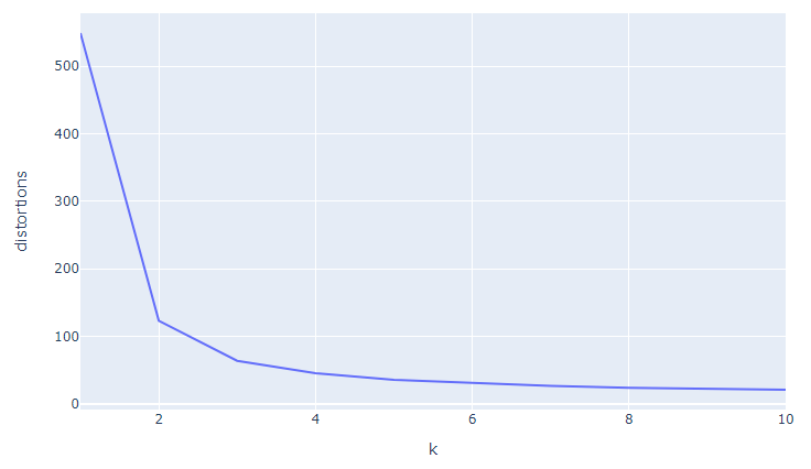
Elbow method를 사용하여 찾은 최적의 k=3
4. 최적의 k 찾기 (KElbowVisualizer)
model 훈련과 함께 그래프를 그려주고 훈련 시간까지 확인해주는 모듈
from yellowbrick.cluster import KElbowVisualizer# KElbowVisualizer 사용하여 훈련과 그래프를 한 번에 해결
km = KMeans()
visualizer = KElbowVisualizer(km, k=(1, 11))
visualizer.fit(train_x)
visualizer.poof()
KElbowVisualizer를 사용하여 찾은 최적의 k=3
5. 최적의 k 찾기 (kneed)
그래프를 확인하지 않고도 최적의 k값을 자동으로 찾아주는 모듈
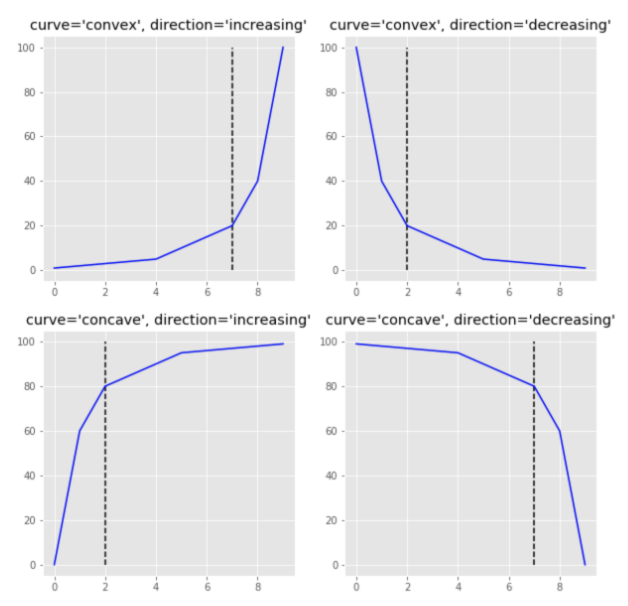
from kneed import KneeLocator# kneed 모듈을 사용하여 자동으로 elbow 값 찾기
kneedle = KneeLocator(x=k_range, y=distortions, curve='convex', direction='decreasing')
print(kneedle.elbow) # 3
print(kneedle.elbow_y) # 63.861880396389324kneed를 사용하여 찾은 최적의 k=3
kneedle.plot_knee()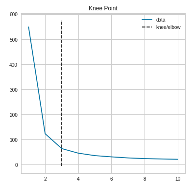
6. 최적의 k 찾기 (Silhouette method)
cluster간의 거리를 사용한 계수로 Silhouette coefficient(SC)값이 최대가 되는 k를 찾는 방법이다.
각 cluster 사이의 거리가 멀고 cluster 내 데이터의 거리가 작을수록 군집 분석의 성능이 좋다.
Silhouette 값은 -1에서 1까지 가능하다.
0은 cluster간의 변별력이 없다는 의미고 -1에 가까울수록 clustering의 결과가 좋지 않음을 의미한다.
from sklearn.metrics import silhouette_score# silhouette_score 모듈 사용
# 군집간의 거리 계산을 하기 때문에, 최소 2개 이상의 label/cluster 필요
silhouette_scores = []
k_range = range(2, 11)
for i in k_range:
km = KMeans(n_clusters=i)
km.fit(train_x)
label = km.predict(train_x)
sc_value = silhouette_score(np.array(train_x), label, metric='euclidean', sample_size=None, random_state=None)
silhouette_scores.append(sc_value)
print(silhouette_scores)
# [0.6813913917541521, 0.5429514489927679, 0.49594823623597434,
# 0.49734559102644377, 0.36944899368921846, 0.3545512741600323,
# 0.359704632778512, 0.3510995523512617, 0.30651928128120054]
# x축이 k의 수, y축이 silhouette scores인 line plot 그리기
fig = px.line(x=k_range, y=silhouette_scores, labels={'x':'k', 'y':'silhouette_scores'})
fig.update_layout(width=800, height=500)
fig.show()
k=6부터 silhouette score 값이 확연히 줄어든다.
→ 최적의 k는 5이하의 수를 선택하는 것이 좋다.
7. 최적의 k 찾기 (SilhouetteVisualizer)
from yellowbrick.cluster import SilhouetteVisualizer# SilhouetteVisualizer 사용하여 훈련과 그래프를 한 번에 해결
k_range = range(2, 11)
for i in k_range:
km = KMeans(n_clusters=i)
visualizer = SilhouetteVisualizer(km)
visualizer.fit(train_x)
visualizer.poof()

각 클러스터의 데이터가 균등하게 분포되어 있고,
모든 클러스터가 평균 실루엣 점수를 넘는 k=3이 최적이다.
8. 최적의 k를 사용하여 모델 훈련
k = 3
km = KMeans(n_clusters=k).fit(train_x)
train_cluster = km.labels_
train_cluster
array([1, 2, 1, 2, 1, 0, 1, 0, 1, 2, 2, 0, 1, 2, 1, 2, 0, 0, 0, 1, 0, 0,
2, 2, 2, 2, 1, 1, 2, 1, 0, 1, 1, 0, 0, 2, 0, 1, 2, 1, 1, 2, 1, 0,
1, 1, 2, 1, 2, 1, 0, 0, 0, 2, 0, 1, 2, 1, 0, 0, 1, 0, 2, 1, 2, 2,
1, 2, 2, 1, 0, 1, 0, 1, 2, 0, 1, 0, 0, 2, 1, 2, 0, 0, 1, 0, 1, 0,
2, 1, 0, 2, 0, 1, 0, 1, 1, 0, 0, 1, 0, 1, 1, 0, 1, 1, 1, 1, 1, 0,
0, 2, 1, 2, 1, 1, 2, 1, 2, 0], dtype=int32)
9. 훈련된 cluster를 그래프로 비교
from plotly.subplots import make_subplots
import plotly.graph_objects as go
# 실제 label과 훈련된 결과 cluster를 그래프로 비교
fig = make_subplots(rows=1, cols=2, subplot_titles=('actual', 'k-means'))
fig.add_trace(
go.Scatter(x=train_x['sepal_width'],
y=train_x['sepal_length'],
mode='markers',
marker=dict(color=train_y)),
row=1, col=1
)
fig.add_trace(
go.Scatter(x=train_x['sepal_width'],
y=train_x['sepal_length'],
mode='markers',
marker=dict(color=train_cluster)),
row=1, col=2
)
fig.update_layout(width=800, height=600)
fig.show()
최적의 k를 사용하여 모델을 훈련한 결과, 실제 label과 유사한 분포를 보인다.
fig = make_subplots(rows=1, cols=2, subplot_titles=('actual', 'k-means'))
fig.add_trace(
    go.Scatter(x=train_x['petal_width'],
               y=train_x['petal_length'],
               mode='markers',
               marker=dict(color=train_y)),
               row=1, col=1
)
fig.add_trace(
    go.Scatter(x=train_x['petal_width'],
               y=train_x['petal_length'],
               mode='markers',
               marker=dict(color=train_cluster)),
               row=1, col=2
)
fig.update_layout(width=800, height=600)
fig.show()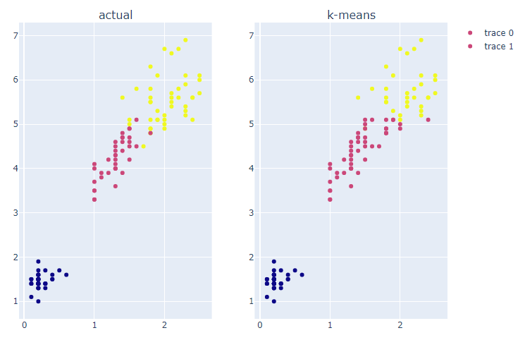
최적의 k를 사용하여 모델을 훈련한 결과, 실제 label과 유사한 분포를 보인다.
10. 훈련된 모델에 test set을 사용하여 predict
test_cluster = km.fit_predict(test_x)
test_cluster
array([1, 0, 0, 1, 2, 0, 2, 1, 1, 2, 0, 1, 2, 0, 0, 1, 0, 0, 1, 1, 0, 0,
2, 1, 2, 0, 1, 1, 0, 0], dtype=int32)
fig = make_subplots(rows=1, cols=2, subplot_titles=('actual', 'k-means'))
fig.add_trace(
    go.Scatter(x=test_x['sepal_width'],
               y=test_x['sepal_length'],
               mode='markers',
               marker=dict(color=test_y)),
               row=1, col=1
)
fig.add_trace(
    go.Scatter(x=test_x['sepal_width'],
               y=test_x['sepal_length'],
               mode='markers',
               marker=dict(color=test_cluster)),
               row=1, col=2
)
fig.update_layout(width=800, height=600)
fig.show()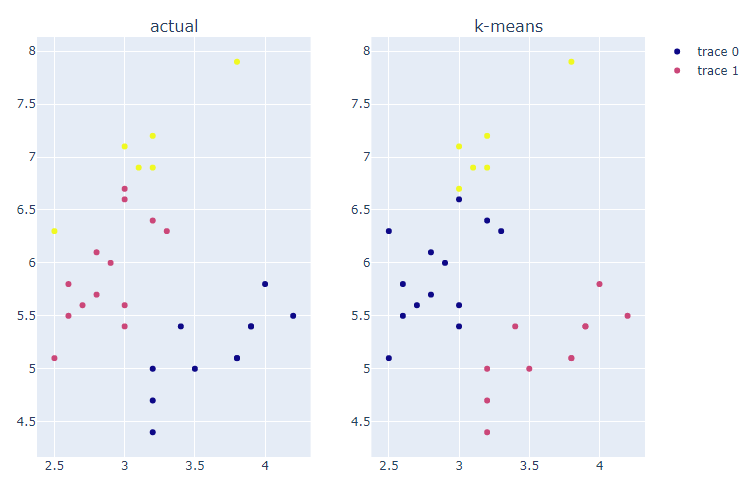
최적의 k를 사용하여 모델을 훈련한 결과, 실제 label과 유사한 분포를 보인다.
그러나 실제 cluster명과 완전히 매칭되지 않는다.
fig = make_subplots(rows=1, cols=2, subplot_titles=('actual', 'k-means'))
fig.add_trace(
    go.Scatter(x=test_x['petal_width'],
               y=test_x['petal_length'],
               mode='markers',
               marker=dict(color=test_y)),
               row=1, col=1
)
fig.add_trace(
    go.Scatter(x=test_x['petal_width'],
               y=test_x['petal_length'],
               mode='markers',
               marker=dict(color=test_cluster)),
               row=1, col=2
)
fig.update_layout(width=800, height=600)
fig.show()
최적의 k를 사용하여 모델을 훈련한 결과, 실제 label과 유사한 분포를 보인다.
그러나 실제 cluster명과 완전히 매칭되지 않는다.
11. clustering 결과를 수치적으로 평가
from sklearn.metrics import accuracy_scoretrain_acc = accuracy_score(train_y, train_cluster)
test_acc = accuracy_score(test_y, test_cluster)
print(train_acc, test_acc) # 0.8833333 0.1666666train_set 정확도 = 0.8833333
test_set 정확도 = 0.1666666
→ 실제와 훈련된 cluster명이 매칭되지 않아서 정확도가 낮게 나온다.
12. 실제 cluster명과 매칭하여 accuracy 확인
import scipydef find_matching_cluster(cluster_case, actual_labels, cluster_labels):
matched_cluster={}
actual_case = list(set(actual_labels))
for i in cluster_case:
idx = cluster_labels == i
new_label = scipy.stats.mode(actual_labels[idx])[0][0]
actual_case.remove(new_label)
matched_cluster[i] = new_label
print(f'훈련된 label명 : {i} >> 가장 빈번한 실제 label명: {new_label}')
return matched_cluster
# 위의 함수를 사용하여 train set의 cluster명 다시 확인
km_train_case = list(set(train_cluster))
print(km_train_case)  # [0, 1, 2]

train_param_dict = find_matching_cluster(km_train_case, train_y, train_cluster)
train_param_dict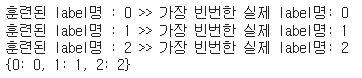
# 위의 함수를 사용하여 test set의 cluster명 다시 확인
km_test_case = list(set(test_cluster))
print(km_test_case)  # [0, 1, 2]

test_param_dict = find_matching_cluster(km_test_case, test_y, test_cluster)
test_param_dict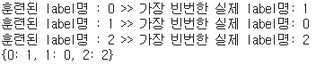
# 함수의 결과 리스트를 사용하여 cluster명 다시 할당
train_new_labels = [train_param_dict[label] for label in train_cluster]
test_new_labels = [test_param_dict[label] for label in test_cluster]
# 새로 할당된 cluster명으로 다시 accuracy score 계산
train_acc = accuracy_score(train_y, train_new_labels)
test_acc = accuracy_score(test_y, test_new_labels)

print(train_acc, test_acc)  # 0.883333 0.933333
train_set 정확도 = 0.8833333
test_set 정확도 = 0.933333
728x90
'데이터 분석 > 실습' 카테고리의 다른 글
| The Iris Dataset (3) - DBSCAN (0) | 2022.01.19 |
|---|---|
| The Iris Dataset (2) - Agglomerative (0) | 2022.01.19 |
| COVID-19 data from John Hopkins University (0) | 2022.01.06 |
| Video Game Sales with Ratings (0) | 2022.01.06 |
| World Happiness Report up to 2020 (0) | 2022.01.05 |
'데이터 분석/실습' Related Articles
more


