
| 일 | 월 | 화 | 수 | 목 | 금 | 토 |
|---|---|---|---|---|---|---|
| 1 | 2 | 3 | ||||
| 4 | 5 | 6 | 7 | 8 | 9 | 10 |
| 11 | 12 | 13 | 14 | 15 | 16 | 17 |
| 18 | 19 | 20 | 21 | 22 | 23 | 24 |
| 25 | 26 | 27 | 28 | 29 | 30 | 31 |
- 카카오
- pandas
- 데이터 분석
- 머신러닝
- SQL
- seaborn
- level 2
- Kaggle
- 실기
- Numpy
- 파이썬
- R
- sklearn
- Python
- Oracel
- 코딩테스트
- 빅데이터 분석 기사
- oracle
- 오라클
- level 1
- 알고리즘
- matplotlib
- 빅분기
- 프로그래머스
- python3
- 실습
- 튜닝
- Today
- Total
라일락 꽃이 피는 날
Heart Failure Prediction 본문
https://www.kaggle.com/andrewmvd/heart-failure-clinical-data
Heart Failure Prediction
12 clinical features por predicting death events.
www.kaggle.com
데이터 정보
- age: 환자의 나이
- anaemia: 환자의 빈혈증 여부 (0: 정상, 1: 빈혈)
- creatinine_phosphokinase: 크레아틴키나제 검사 결과
- diabetes: 당뇨병 여부 (0: 정상, 1: 당뇨)
- ejection_fraction: 박출계수 (%)
- high_blood_pressure: 고혈압 여부 (0: 정상, 1: 고혈압)
- platelets: 혈소판 수 (kiloplatelets/mL)
- serum_creatinine: 혈중 크레아틴 레벨 (mg/dL)
- serum_sodium: 혈중 나트륨 레벨 (mEq/L)
- sex: 성별 (0: 여성, 1: 남성)
- smoking: 흡연 여부 (0: 비흡연, 1: 흡연)
- time: 관찰 기간 (일)
- DEATH_EVENT: 사망 여부 (0: 생존, 1: 사망)
데이터셋 준비
import numpy as np
import pandas as pd
import matplotlib.pyplot as plt
import seaborn as sns
# pd.read_csv()로 csv파일 읽어들이기
df = pd.read_csv('../input/heart-failure-clinical-data/heart_failure_clinical_records_dataset.csv')
EDA 및 데이터 기초 통계 분석
df.head()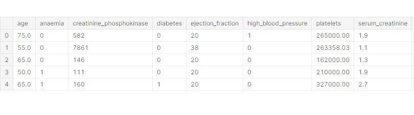
수치형 데이터: age, creatinine_phosphokinase, ejection_fraction, platelets, serum_creatinine, serum_sodium, time
범주형 데이터: anaemia, diabetes, high_blood_pressure, sex, smoking
타겟 데이터: DEATH_EVENT
df.info()
<class 'pandas.core.frame.DataFrame'>
RangeIndex: 299 entries, 0 to 298
Data columns (total 13 columns):
 #   Column                    Non-Null Count  Dtype
---  ------                    --------------  -----
 0   age                       299 non-null    float64
 1   anaemia                   299 non-null    int64
 2   creatinine_phosphokinase  299 non-null    int64
 3   diabetes                  299 non-null    int64
 4   ejection_fraction         299 non-null    int64
 5   high_blood_pressure       299 non-null    int64
 6   platelets                 299 non-null    float64
 7   serum_creatinine          299 non-null    float64
 8   serum_sodium              299 non-null    int64
 9   sex                       299 non-null    int64
 10  smoking                   299 non-null    int64
 11  time                      299 non-null    int64
 12  DEATH_EVENT               299 non-null    int64
dtypes: float64(3), int64(10)
memory usage: 30.5 KB
(299, 13) → 299 rows 13 columns
null 데이터 없음
df.describe()
creatinine_phosphokinase의 최댓값이 비정상적으로 큰 것으로 보인다 → outlier
# seaborn의 histplot()로 히스토그램 그리기
# hue 옵션으로 데이터 비교, 겹치는 부분은 회색
# kde 옵션으로 커널밀도추정 그리기, 부드러운 분포 곡선
# bins 옵션으로 bin 개수 지정
sns.histplot(x='age', data=df, hue='DEATH_EVENT', kde=True)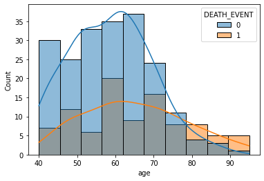
70대 중후반 부터는 생존자보다 사망자의 수가 더 많고, 생존자의 수가 급격히 줄어든다
→ 나이는 생존율에 영향을 준다.
# sns.histplot(data=df['creatinine_phosphokinase'])
sns.histplot(data=df.loc[df['creatinine_phosphokinase'] < 3000, 'creatinine_phosphokinase'])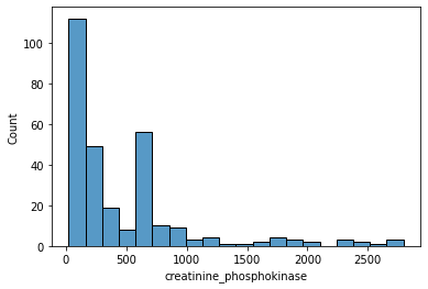
크레아틴키나제 수치(creatinine_phosphokinase)가 3000이 넘는 경우는 거의 없기 때문에 outlier로 분류한다.
creatinine_phosphokinase 범위를 3000 미만으로 정하고 히스토그램을 그린다.
sns.histplot(x='ejection_fraction', data=df, bins=13, hue='DEATH_EVENT', kde=True)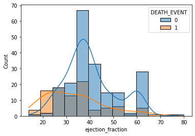
박출계수(ejection_fraction)가 낮을수록 사망할 확률이 높고, 25% 미만일 경우 생존자보다 사망자가 더 많다.
→ 박출계수는 생존율에 영향을 준다.
sns.histplot(x='platelets', data=df, bins=13, hue='DEATH_EVENT')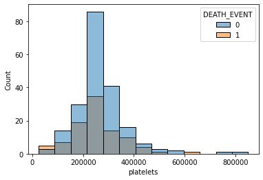
혈소판 수(platelets)는 생존율에 영향을 주는지 확실히 알 수 없다.
sns.histplot(x='time', data=df, hue='DEATH_EVENT', kde=True)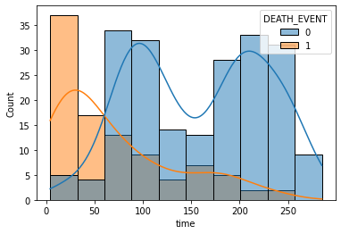
관찰 기간(time)이 짧을수록 생존자보다 사망자 수가 더 많은 것은 사실이지만, 사망했기 때문에 관찰 기간이 짧게 나올 수 있다.
time 데이터에는 이미 DEATH_EVENT 데이터의 결과가 포함된다는 것이다.
따라서, time 데이터는 배제하고 학습하는 것이 좋다.
# seaborn의 jointplot()로 산점도와 히스토그램을 함께 그리기
# alpha 옵션으로 투명도 조절, 겹치는 부분을 명확히 볼 수 있음
sns.jointplot(x='ejection_fraction', y='serum_creatinine', hue='DEATH_EVENT', data=df)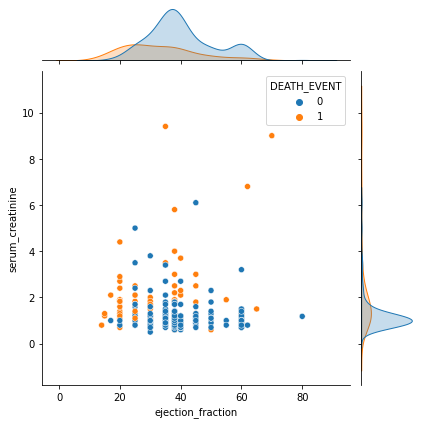
박출계수(ejection_fraction)가 높고 혈중 크레아틴 레벨(serum_creatinine)이 낮을수록 생존율이 높다.
# seaborn의 boxplot()로 박스플롯 그리기
sns.boxplot(x='DEATH_EVENT', y='ejection_fraction', data=df)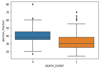
# seaborn의 violinplot()로 바이올린플롯 그리기
sns.violinplot(x='DEATH_EVENT', y='ejection_fraction', data=df)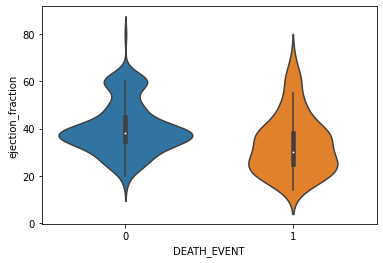
# swarmplot = violinplot + scatterplot
# swarmplot에서는 hue 옵션 사용이 유용함
sns.swarmplot(x='DEATH_EVENT', y='platelets', hue='smoking', data=df)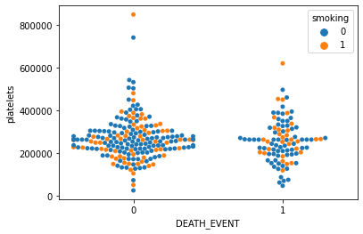
데이터 전처리
from sklearn.preprocessing import StandardScaler
# 수치형 입력 데이터, 범주형 입력 데이터, 출력 데이터로 구분
X_num =  df[['age', 'creatinine_phosphokinase', 'ejection_fraction', 'platelets', 'serum_creatinine', 'serum_sodium']]
X_cat = df[['anaemia', 'diabetes', 'high_blood_pressure', 'sex', 'smoking']]
y = df['DEATH_EVENT']
# StandardScaler을 이용하여 수치형 데이터 표준화 진행
# 평균 0, 표준편차 1이 되도록 변환
scaler = StandardScaler()
scaler.fit(X_num)
X_scaled = scaler.transform(X_num)
# StandardScaler로 데이터를 전처리하면 numpy 형태로 바뀌기 때문에 다시 DataFrame 형태로 바꾸는 것이 좋음
X_scaled = pd.DataFrame(data=X_scaled, index=X_num.index, columns=X_num.columns)
# concat을 이용하여 수치형 데이터와 범주형 데이터를 병합
# axis=1 옵션으로 column끼리 합침
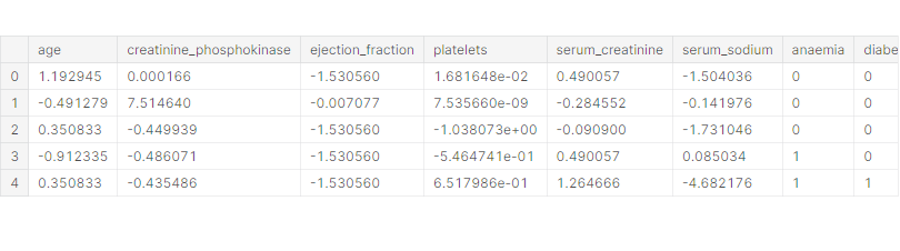
X = pd.concat([X_scaled, X_cat], axis=1)X.head()
학습 데이터와 테스트 데이터 분리
from sklearn.model_selection import train_test_split
# train_test_split을 이용하여 학습 데이터와 테스트 데이터 분리
# test_size=0.3 → 70% train, 30% test 데이터로 사용
# shuffle=False : 시간적 관계가 있어서 앞의 데이터로 학습하고 뒤의 데이터로 테스트해야 할 때 사용
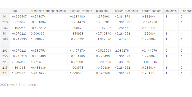
X_train, X_test, y_train, y_test = train_test_split(X, y, test_size=0.3, random_state=1)X_train
Classification 모델 학습
1. Logistic Regression 모델
from sklearn.linear_model import LogisticRegression
# LogisticRegression 모델 생성/학습
# verbose=1 옵션으로 학습 과정 표현
# iteration이 부족하여 학습이 되지 않을 때는 max_iter 값 높이기
model_lr = LogisticRegression()
model_lr.fit(X_train, y_train)
from sklearn.metrics import classification_report
# classification_report을 이용하여 모델 학습 결과 평가
pred = model_lr.predict(X_test)
print(classification_report(y_test, pred))
precision recall f1-score support
0 0.78 0.92 0.84 64
1 0.64 0.35 0.45 26
accuracy 0.76 90
macro avg 0.71 0.63 0.65 90
weighted avg 0.74 0.76 0.73 90
정확도(accuracy) = 0.76 (76%)
2. XGBoost 모델
from xgboost import XGBClassifier
# XGBClassifier 모델 생성/학습
model_xgb = XGBClassifier(eval_metric='mlogloss')
model_xgb.fit(X_train, y_train)
pred = model_xgb.predict(X_test)
print(classification_report(y_test, pred)) precision recall f1-score support
0 0.81 0.88 0.84 64
1 0.62 0.50 0.55 26
accuracy 0.77 90
macro avg 0.72 0.69 0.70 90
weighted avg 0.76 0.77 0.76 90
정확도(accuracy) = 0.77 (77%)
# XGBClassifier 모델의 feature_importances_를 이용하여 피쳐 중요도 확인
plt.bar(X.columns, model_xgb.feature_importances_)
plt.xticks(rotation=90)
plt.show()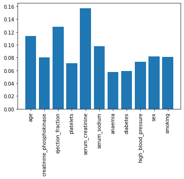
serum_creatinine와 ejection_fraction 피쳐 중요도가 높다.
모델 학습 결과 심화 분석
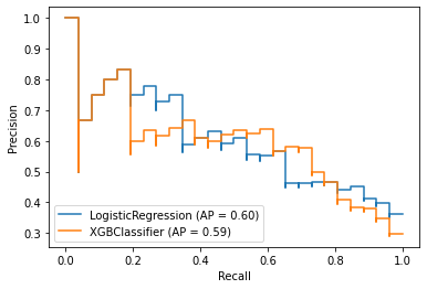
1. Precision-Recall 커브
from sklearn.metrics import plot_precision_recall_curve
# 두 모델의 Precision-Recall 커브 한 번에 그리기
# plt.figure() : 그래프가 그려지는 전체 캔버스
fig = plt.figure()
ax = fig.gca()
plot_precision_recall_curve(model_lr, X_test, y_test, ax=ax)
plot_precision_recall_curve(model_xgb, X_test, y_test, ax=ax)
2. ROC 커브
from sklearn.metrics import plot_roc_curve
# 두 모델의 ROC 커브 한 번에 그리기
fig = plt.figure()
ax = fig.gca()
plot_roc_curve(model_lr, X_test, y_test, ax=ax)
plot_roc_curve(model_xgb, X_test, y_test, ax=ax)
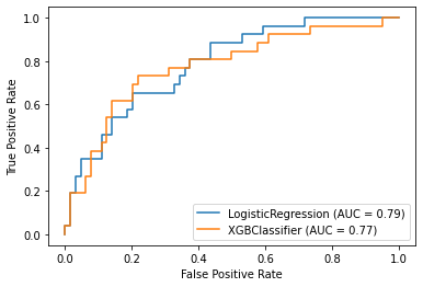
AUC = ROC 커브 아래 영역
AUC가 클수록 좋으므로 LogisticRegression 모델의 성능이 XGBoost 모델보다 조금 더 좋다.
'데이터 분석 > 실습' 카테고리의 다른 글
| Used Cars (0) | 2022.01.03 |
|---|---|
| US Election 2020 (0) | 2021.12.27 |
| European Soccer (0) | 2021.12.27 |
| League of Legends Diamond Ranked Games (10 min) (0) | 2021.12.23 |
| Students' Academic Performance (0) | 2021.12.23 |


