
League of Legends Diamond Ranked Games (10 min)
https://www.kaggle.com/bobbyscience/league-of-legends-diamond-ranked-games-10-min
League of Legends Diamond Ranked Games (10 min)
Classify LoL ranked games outcome by looking at the first 10min worth of data
www.kaggle.com
데이터 정보
- gameId: 게임 판의 고유 ID
- blueWins: 블루팀의 승리 여부 (0: 패배, 1: 승리)
- xxxWardsPlaced: xxx팀에서 설치한 와드의 수
- xxxWardsDestroyed: xxx팀에서 파괴한 와드의 수
- xxxFirstBlood: xxx팀의 첫번째 킬 달성 여부
- xxxKills: xxx팀의 킬 수
- xxxDeaths: xxx팀의 죽음 수
- xxxAssists: xxx팀의 어시스트 수
- xxxEliteMonsters: xxx팀이 죽인 엘리트 몬스터 수
- xxxDragons: xxx팀이 죽인 용의 수
- xxxHeralds: xxx팀이 죽인 전령의 수
- xxxTowersDestroyed: xxx팀이 파괴한 탑의 수
- xxxTotalGold: xxx팀의 전체 획득 골드
- xxxAvgLevel: xxx팀의 평균 레벨
- xxxTotalExperience: xxx팀의 총 경험치 획득량
- xxxTotalMinionsKilled: xxx팀의 총 미니언 킬 수
- xxxTotalJungleMinionsKilled: xxx팀의 총 정글 미니언 킬 수
- xxxGoldDiff: xxx팀과 다른 팀 간의 골드 획득량 차이
- xxxExperienceDiff: xxx팀과 다른 팀과의 경험치 획득량 차이
- xxxCSPerMin: xxx팀의 분당 CS 스코어
- xxxGoldPerMin: xxx팀의 분당 골드 획득량
데이터셋 준비
import pandas as pd
import numpy as np
import matplotlib.pyplot as plt
import seaborn as sns
# pd.read_csv()로 csv파일 읽어들이기
df = pd.read_csv('../input/league-of-legends-diamond-ranked-games-10-min/high_diamond_ranked_10min.csv')EDA 및 데이터 기초 통계 분석
df.head()
수치형 데이터: xxxWardsPlaced, xxxWardsDestroyed, xxxKills, xxxAssists, xxxEliteMonsters, xxxTowersDestroyed, xxxTotalGold, xxxAvgLevel, xxxTotalExperience, xxxTotalMinionsKilled, xxxTotalJungleMinionsKilled, xxxGoldDiff, xxxExperienceDiff, xxxCSPerMin, xxxGoldPerMin
범주형 데이터: xxxFirstBlood, xxxDragons, xxxHeralds
타겟 데이터: blueWins
df.info()<class 'pandas.core.frame.DataFrame'>
RangeIndex: 9879 entries, 0 to 9878
Data columns (total 40 columns):
# Column Non-Null Count Dtype
--- ------ -------------- -----
0 gameId 9879 non-null int64
1 blueWins 9879 non-null int64
2 blueWardsPlaced 9879 non-null int64
3 blueWardsDestroyed 9879 non-null int64
4 blueFirstBlood 9879 non-null int64
5 blueKills 9879 non-null int64
6 blueDeaths 9879 non-null int64
7 blueAssists 9879 non-null int64
8 blueEliteMonsters 9879 non-null int64
9 blueDragons 9879 non-null int64
10 blueHeralds 9879 non-null int64
11 blueTowersDestroyed 9879 non-null int64
12 blueTotalGold 9879 non-null int64
13 blueAvgLevel 9879 non-null float64
14 blueTotalExperience 9879 non-null int64
15 blueTotalMinionsKilled 9879 non-null int64
16 blueTotalJungleMinionsKilled 9879 non-null int64
17 blueGoldDiff 9879 non-null int64
18 blueExperienceDiff 9879 non-null int64
19 blueCSPerMin 9879 non-null float64
20 blueGoldPerMin 9879 non-null float64
21 redWardsPlaced 9879 non-null int64
22 redWardsDestroyed 9879 non-null int64
23 redFirstBlood 9879 non-null int64
24 redKills 9879 non-null int64
25 redDeaths 9879 non-null int64
26 redAssists 9879 non-null int64
27 redEliteMonsters 9879 non-null int64
28 redDragons 9879 non-null int64
29 redHeralds 9879 non-null int64
30 redTowersDestroyed 9879 non-null int64
31 redTotalGold 9879 non-null int64
32 redAvgLevel 9879 non-null float64
33 redTotalExperience 9879 non-null int64
34 redTotalMinionsKilled 9879 non-null int64
35 redTotalJungleMinionsKilled 9879 non-null int64
36 redGoldDiff 9879 non-null int64
37 redExperienceDiff 9879 non-null int64
38 redCSPerMin 9879 non-null float64
39 redGoldPerMin 9879 non-null float64
dtypes: float64(6), int64(34)
memory usage: 3.0 MB
(9879, 40) → 9879 rows 40 columns
null 데이터 없음
df.describe()blueWardsPlaced 최댓값이 비정상적으로 큰 것으로 보인다 → outlier
# DataFrame의 corr()로 각 컬럼의 correlation 조회
df.corr()
# seaborn의 heatmap()로 히트맵 그리기
# annot=True 옵션으로 수치 표시
fig = plt.figure(figsize=(4,10))
sns.heatmap(df.corr()[['blueWins']], annot=True)
blueGoldDiff와 blueExperienceDiff가 클수록 블루팀이 승리한다.
blueDeaths가 클수록 블루팀이 패배한다.
# seaborn의 histplot()로 히스토그램 그리기
# palette 옵션으로 색상 설정
sns.histplot(x='blueGoldDiff', data=df, hue='blueWins', palette='RdBu', kde=True)
골드 획득량 차이(blueGoldDiff)가 블루팀이 더 높을수록 블루팀이 승리한다.
sns.histplot(x='blueKills', data=df, hue='blueWins', palette='RdBu', kde=True, bins=8)
블루팀의 킬 수(blueKills)가 많을수록 블루팀이 승리하지만, 큰 차이는 없다.
# seaborn의 jointplot()로 산점도와 히스토그램을 함께 그리기
sns.jointplot(x='blueKills', y='blueGoldDiff', data=df, hue='blueWins')
블루팀이 레드팀보다 골드 획득량이 많고, 블루팀의 킬 수가 많을수록 블루팀이 승리한다.
sns.jointplot(x='blueExperienceDiff', y='blueGoldDiff', data=df, hue='blueWins')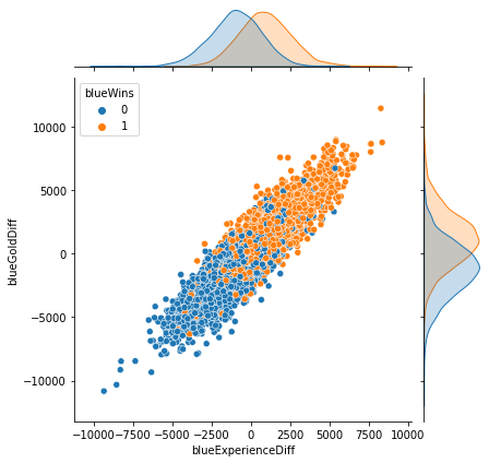
y=x 형태에 가까울수록 두 변수의 상관성이 높다.
→ blueExperienceDiff와 blueGoldDiff의 상관성이 매우 높다.
경험치를 많이 획득할수록 골드도 많이 획득했을 것이기 때문이다.
# seaborn의 countplot()로 범주별 통계 그리기
sns.countplot(x='blueFirstBlood', data=df, hue='blueWins', palette='RdBu')
블루팀이 첫 번째 킬을 달성하면 블루팀이 승리할 확률이 높다.
sns.countplot(x='blueDragons', data=df, hue='blueWins', palette='RdBu')
블루팀이 용을 죽이면 블루팀이 승리할 확률이 높다.
sns.countplot(x='redDragons', data=df, hue='blueWins', palette='RdBu')
레드팀이 용을 죽이면 블루팀이 패배할 확률이 높다.
데이터 전처리
from sklearn.preprocessing import StandardScaler# Multicollinearity(다중공산성)를 피하기 위해 불필요한 컬럼 제거
df.drop(['gameId', 'redFirstBlood', 'redKills', 'redDeaths',
'redTotalGold', 'redTotalExperience', 'redGoldDiff',
'redExperienceDiff'], axis=1, inplace=True)# 수치형 입력 데이터, 범주형 입력 데이터, 출력 데이터로 구분
X_num = df[['blueWardsPlaced', 'blueWardsDestroyed', 'blueKills', 'blueDeaths',
'blueAssists', 'blueEliteMonsters', 'blueTowersDestroyed', 'blueTotalGold',
'blueAvgLevel', 'blueTotalExperience', 'blueTotalMinionsKilled',
'blueTotalJungleMinionsKilled', 'blueGoldDiff', 'blueExperienceDiff',
'blueCSPerMin', 'blueGoldPerMin', 'redWardsPlaced', 'redWardsDestroyed',
'redAssists', 'redEliteMonsters', 'redTowersDestroyed', 'redAvgLevel',
'redTotalMinionsKilled', 'redTotalJungleMinionsKilled', 'redCSPerMin', 'redGoldPerMin']]
X_cat = df[['blueFirstBlood', 'blueDragons', 'blueHeralds', 'redDragons', 'redHeralds']]
y = df['blueWins']
# StandardScaler을 이용하여 수치형 데이터 표준화 진행
scaler = StandardScaler()
scaler.fit(X_num)
X_scaled = scaler.transform(X_num)
X_scaled = pd.DataFrame(X_scaled, index=X_num.index, columns=X_num.columns)

X = pd.concat([X_scaled, X_cat], axis=1)
X
학습 데이터와 테스트 데이터 분리
from sklearn.model_selection import train_test_split# train_test_split을 이용하여 학습 데이터와 테스트 데이터 분리
X_train, X_test, y_train, y_test = train_test_split(X, y, test_size=0.3, random_state=1)Classification 모델 학습
1. Logistic Regression 모델
from sklearn.linear_model import LogisticRegression# LogisticRegression 모델 생성/학습
model_lr = LogisticRegression()
model_lr.fit(X_train, y_train)
from sklearn.metrics import classification_reportpred = model_lr.predict(X_test)
print(classification_report(y_test, pred)) precision recall f1-score support
0 0.74 0.75 0.74 1469
1 0.75 0.74 0.74 1495
accuracy 0.74 2964
macro avg 0.74 0.74 0.74 2964
weighted avg 0.74 0.74 0.74 2964
정확도(accuracy) = 0.74 (74%)
2. XGBoost 모델
from xgboost import XGBClassifier# XGBClassifier 모델 생성/학습
model_xgb = XGBClassifier(use_label_encoder=False, eval_metric='mlogloss')
model_xgb.fit(X_train, y_train)
pred = model_xgb.predict(X_test)
print(classification_report(y_test, pred))
precision recall f1-score support
0 0.72 0.72 0.72 1469
1 0.72 0.73 0.73 1495
accuracy 0.72 2964
macro avg 0.72 0.72 0.72 2964
weighted avg 0.72 0.72 0.72 2964
정확도(accuracy) = 0.72 (72%)
모델 학습 결과 심화 분석
1. Logistic Regression 모델 계수로 상관성 파악
model_lr.coef_array([[-0.03722312, -0.02280321, -0.16394534, 0.00258791, -0.03347599,
0.11396334, -0.1138962 , 0.30622615, -0.07285938, 0.03729869,
-0.0372248 , 0.01932872, 0.44377859, 0.42423486, -0.0372248 ,
0.30622615, -0.02448855, -0.0133212 , 0.07023347, -0.07907826,
0.05399199, -0.00977213, 0.03659856, 0.03652838, 0.03659856,
-0.4148868 , 0.03551527, 0.17068559, -0.11330011, -0.13009491,
0.06607254]])
# Logistic Regression 모델의 coef_ 속성으로 plot 그리기
model_coef = pd.DataFrame(data=model_lr.coef_[0], index=X.columns, columns=['Model Coefficient'])
model_coef.sort_values(by='Model Coefficient', ascending=False, inplace=True)

fig = plt.figure(figsize=(10, 10))
plt.barh(model_coef.index, model_coef['Model Coefficient'])
plt.grid()
plt.show()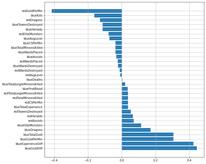
블루팀이 레드팀보다 골드와 경험치 획득량이 많을수록 블루팀이 승리할 확률이 높다.
2. XGBoost 모델로 특징의 중요도 확인
# XGBoost 모델의 feature_importances_ 속성으로 plot 그리기
fig = plt.figure(figsize=(10, 10))
plt.barh(X.columns, model_xgb.feature_importances_)
blueGoldDiff 피쳐 중요도가 가장 높다.